Launch
-

Helping Hand 2016 print campaign
February 20, 2016The Helping Hand charity provides community support to enable elderly people in Hong Kong to enjoy a rich and dignified life. Since 1978, when it was founded as a community initiative to assist 100 elderly men living in abject conditions, Helping Hand has rehoused over 8,000 elderly people. In addition to 'Care Homes', 'Housing for the Elderly' units, a 'Holiday Centre' in Sai Kung, and a 'China Home' in Zhaoqing, Helping Hand also provides physiotherapy, occupational therapy and rehabilitative services to improve the quality of life and physical well-being of Hong Kong seniors. Every year, Helping Hand's primary fund-raising appeal is a city-wide print campaign, which exhorts the community to buy boxes of cookies. Billboards and posters appear throughout the network of Mass Transit Railway (MTR) stations, other public transport entities, shopping centres and retailers. Since 1998, Digital Tsunami Head of Production Andy Chan, has supported Helping Hand by producing photographic sessions with much-loved Hong Kong singer-songwriter and actor, Jacky Cheung. Digital Tsunami is delighted to continue to contribute to this valuable initiative. helpinghand.org.hk -
Cohesive marketing for luxury apartments
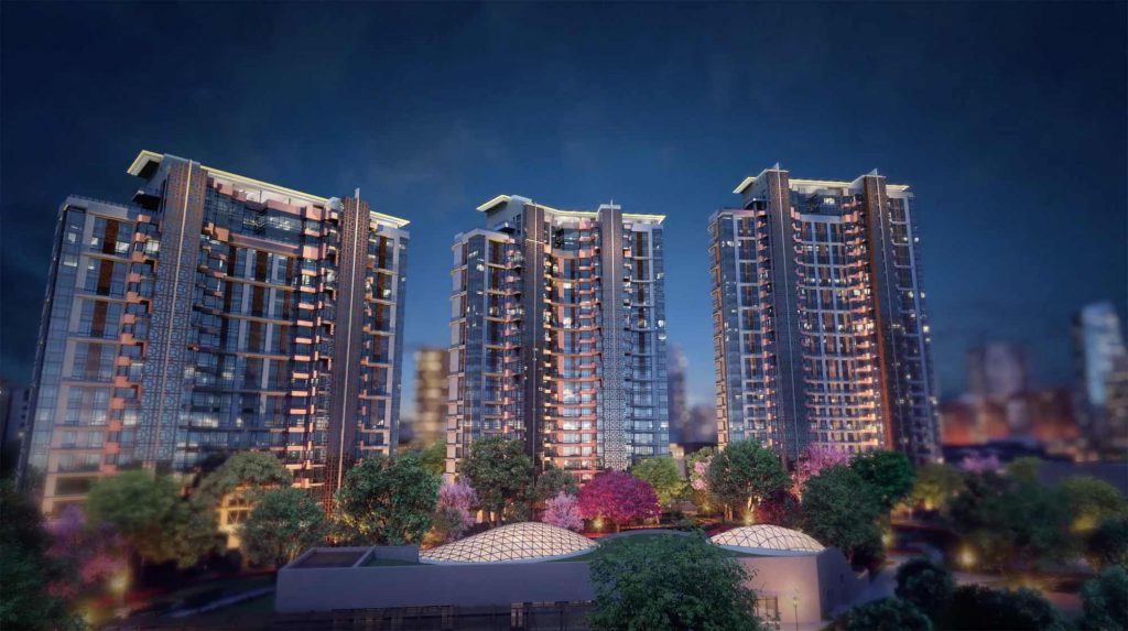
November 26, 2015Digital Tsunami offers an extensive range of solutions. It is rare that a client requires ALL these are delivered within a single project, however recently this was the case. In July, founder of Digital Tsunami and veteran marketing professional Andrew W Morse, was commissioned as Creative Director for the promotion of 168 luxury apartments in Yinchuan, China. His responsibility was vision and strategy for the launch of this exceptional property. Master Residences Yinchuan is an exclusive residential precinct in northern China. The capital of the autonomous Ningxia region, Yinchuan is the seat of the Hui people, adjacent to Inner Mongolia, and a key stop on the Silk Road, which was the ancient overland trade route between Europe and the Orient. This has become even more important as Beijing implements the 'One Belt, One Road' policy (acronym: OBOR). The three towers of the Master Residences Yinchuan exemplify the best of East and West. Sinuous curves on the exterior pay homage to the shifting sand dunes of the surrounding desert. The technology throughout the site is global best-of-breed, with 66 suppliers from around the globe contributing their expertise and superlative products to make these apartments among the most contemporary and innovative residences in China today. Within four months, an international team produced a comprehensive range of bilingual advertising materials, marketing collaterals and premiums, including:- branding, brandline and identity
- computer graphics
- city, precinct, exteriors and interiors
- copywriting (English and simplified Chinese characters)
- online
- dual responsive sites
- mobile site compliance
- photography
- premiums
- a debossed leather notepad and branded executive pen in a presentation case
- a luxury branded carry bag
- press
- a double page press ad
- print
- letterhead and envelopes
- a presentation folder
- a diecut foiled invitation card, metallic paper envelope and hand stamped wax seal with silk tassel
- a bilingual retractable banner
- dual language 4 page datasheets
- bilingual 48 page softbound booklet
- bilingual 106 page hardbound owner's book
- bilingual 248 page hardbound technical book
- video production
- 4K aerials
- three bilingual videos
- a printed video 'book' with auto-playing integrated video screen
-
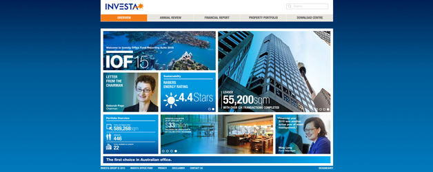
Responsive design for listed property fund
September 30, 2015Digital Tsunami has launched the 2015 online Annual Review, Financial Report and Property Portfolio of the Investa Office Fund (ASX:IOF). This site is the second which Digital Tsunami has developed to the instructions of Sydney creative shop Design Davey. Managed by Investa Property Group, the IOF is one of the largest office real estate companies in Australia and a leading residential and industrial land developer with properties across Australia and in Europe. WIth a bold and interactive geometric structure, the responsive design site displays appropriately on any device from smartphones, phablets, tablets and laptops to the largest desktop computer screen. Infographics, sliders, and videos add dynamism to the mass of data and imagery presented in the site. Despite the relatively short time window available, between the date of information confirmation and the ASX compliance date, the Digital Tsunami team, headed by Technical Director Amir Mostofi, delivered a powerful and effective presence. Contact Digital Tsunami today to discuss the 'Communications Evolution' of your brand. -
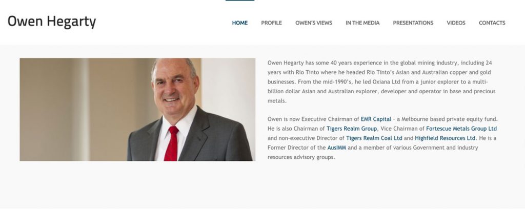
Refresh for the Owen Hegarty responsive site
July 14, 2015After four decades in the global mining industry, (including years as Managing Director of Rio Tinto Asia and Rio Tinto’s Australian copper and gold business), Owen Hegarty is in high demand. Since launching a contemporary, responsive web presence in late 2013, he has continued a series of frequent presentations at international conferences and interviews by the financial media. While adding new content in critical to SEO and visitor engagement, all web sites benefit from a regular visual refresh. The OwenHegarty.com site has just been revitalised, with a new welcome page layout focusing on corporate portrait photography and emphasising the Directorships ad executive roles which Owen holds. He is currently Executive Chairman of EMR Capital (a Melbourne based private equity fund), Chairman of Tigers Realm Group, Executive Vice Chairman of Hong Kong listed G-Resources Group, Vice Chairman of Fortescue Metals Group Ltd, non-executive Director of Tigers Realm Coal Ltd and Highfield Resources Ltd, a Former Director of the AusIMM and a member of various Government and industry resources advisory groups. Digital Tsunami is proud to be associated with such an important businessman, and has delivered solutions to clients in the resources sector for many years. These solutions have included recent work for a China new energy company (collaterals style guide. print, photography, bilingual web and video, 4K aerials and time-lapse photography), and past software,photography and online solutions for clients in countries from Australia and Brazil to the USA and the UAE. -
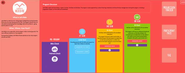
Cycling Australia launches initiative with Polymer design
July 1, 2015Cycling Australia has launched an initiative to encourage kids across the country to have fun riding bikes! Let's Ride is a national program designed by Cycling Australia to educate primary age children to ride bicycles with confidence and safety. To reflect the fun learning experience, Digital Tsunami was commissioned to develop a complex interactive solution, presented in a bright and colourful interface. This responsive site was one of the first in the world, designed in Polymer 1.0. As a dynamic front-end design tool, Polymer is cutting edge technology; and a powerful successor to HTML5 and Flash. Polymer has been utilised to create a bold, simple, dynamic site. The simplicity and engaging dynamism of the colourful 'Mondrianesque' design, conceals a highly complex backend, integrating a database (comprising program, location, session and attendee information); secure interfaces (for program administrators, schools, instructors to manage the programs, and for parents to monitor participant's progress); and an interactive public site for location-based searches. The responsive Let's Ride site also features: full-screen expanding panels; dynamic movement; integrated video; online registration forms with secure e.commerce; and an comprehensive Intranet for administrators, instructors and parents. The Let's Ride online project was a collaboration between Cycling Australia, strategic marketing consultant Sam Trattles of The Other Side of the Table, graphic iconography and components supplied by Elite Sports, and Digital Tsunami's crack Polymer design, database and development team: Paul, Yan, Natalia, Rasch and Heather. A 'triple tier' approach was used to innoculate design, functionality and database development, so that modifications to any one of these did not impact on the others. Digital Tsunami has developed numerous websites across the whole spectrum of the education and training sector: pre-primary, primary, secondary, tertiary, technical training and further education. All websites developed by Digital Tsunami are built with responsive design. The mobile search criteria of the latest Google algorithm and the unceasing ascent of all statistics related to mobile device usage, ensure that a responsive site is mandatory for all corporations and organisations. Contact Digital Tsunami today to discuss increased effectiveness for your online presence. -

TravMatt site goes responsive
April 22, 2015Digital Tsunami has developed and launched a site using responsive design, for professional cameraman Matt Gormly. Matt shoots for clients and on locations around the world. Travelling Matt is the company name given to Matt Gormly by Andrew W Morse, when Matt started flying and working around the globe. The two met in Australia in 1991, just before they both left for Hong Kong, with a week of each other. The brand name conveys both the extensive geographical range of Matt's experience, but also refers to a traditional special effects filmmaking technique which combines a moving matte over a foreground or background shot into a single, cohesive image. Matt has an extraordinary ability to expose the essence in a person or product to convey an evocative, cohesive and comprehensive visual ambience. Matt has previously lived in Australia, Hong Kong, The Philippines and Malaysia. Regularly returning to his native Australia to shoot, Matt now lives in Kalmar Country, south of Stockholm. Built to Matt's concept and design, the TravMatt site features capabilities, news, projects, image galleries, and is driven by the easy-to-use WordPress content management system (CMS). In the last decade, Digital Tsunami has developed three website iterations for the brand and has provided hosting and technical support. Read about the benefits of responsive design and the necessity for a mobile-friendly site to retain Google ranking in mobile search results. Read more about mobile. A selection of responsive sites by Digital Tsunami: Bi-lingual site for energy company, Hanas New Energy Tri-lingual site for incorporation firm, Comsec Offshore Women's mentoring network, SheBusiness Cameragal Montessori pre-primary and primary School Property investment advisor, Compass Capital Defence contractor, Craig International Ballistics National logistics charity, Foodbank in Australia Canberra construction company, Group One 'The Voice' finalist, Jenna Dearness-Dark Government department, Lachlan Riverine Working Group- Mining magnate Owen Hegarty Electrical installers, Sydney Energy East coast hotel chain, View Hotels Thai restaurant, Tamarind Thai Contact Digital Tsunami today to discuss the 'Communications Evolution' of your brand. -
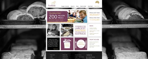
Foodbank in Australia launches new identity
October 17, 2014Foodbank in Australia has just launched a new identity for the brand across the country. Devised by the advertising agency Havas (Sydney) the new branding will rollout over coming months, to distribution centres, vehicles, apparel and marketing collaterals. Havas also supplied an animated video which tells the Foodbank story simply and succinctly. Foodbank is the largest hunger relief organisation in Australia, with distribution centres in all state capitals and a number of regional centres, which has delivered the equivalent of 200 million meals since 1992. This national network of non-denominational, non-profit, state and territory logistics suppliers, provides a warehousing and distribution conduit between food producers, manufacturers and retailers with surplus food and grocery items and the thousands of charities and community groups which feed hungry families and individuals across the country. Digital Tsunami is pleased to continue its long relationship with Foodbank in Australia. Since commencing pro bono support of Foodbank in 2000, Digital Tsunami has developed and hosted the multiple federal and regional websites and produced multiple videos. The most dramatic visual changes which have occurred have been in identity. From the rudimentary appearance and multifarious branding of the late 20th century, the Foodbank web presence has refined and gained coherence and consistency. The latest evolution of the brand, launched today at The Big Breakfast in Sydney, has a simplicity and impact which befits an important, contemporary, nationwide organisation. This identity was rapidly applied to the responsive, fifth iteration of the Foodbank web presence, which features a welcome page image grid that adjusts content and positioning to the device on which it is viewed. The semi-autonomous state and territory bodies have the flexibility to adjust their site's key messages and calls to action, specific to four different browser widths. The responsive Foodbank site features full-screen vectored background images, dynamic statistics, integrated videos, archived publications, donation forms with secure e.commerce, and hierarchical access to a sophisticated and easy-to-use WordPress content management system (CMS). For the last two years, Digital Tsunami has exclusively developed responsive sites. The relentless growth of all statistics related to mobile device usage, indicates that a responsive site is a necessity for all corporations and organisations. Contact Digital Tsunami today to discuss the 'Communications Evolution' of your brand. -
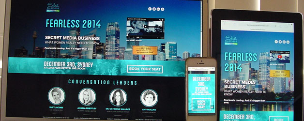
Responsive microsite for Fearless event
August 30, 2014Digital Tsunami has developed and launched a microsite for the Fearless 2014 women's business event, using responsive design. The event, conceived and operated by Australian consultancy She Business, attracts a larger number of female entrepreneurs and businesswomen, every year. Fearless 2014 will be convened on December 3rd at Crystal Palace, Luna Park, Sydney. The responsive microsite integrates a video, speaker bios, schedule, booking form and logo links to the partners and supporters of the event. The microsite is presented in a contemporary 'flat design' by Sydney firm, Studio Popsicle. Read about the benefits of responsive design. Digital Tsunami has a philosophy of agile development and promotion of innovative, proven solutions. Read more about mobile. A selection of responsive sites by Digital Tsunami: Cameragal Montessori pre-primary and primary School Property investment advisor, Compass Capital Defence contractor, Craig International Ballistics National logistics charity, Foodbank in Australia Canberra construction company, Group One 'The Voice' finalist, Jenna Dearness-Dark Government department, Lachlan Riverine Working Group- Mining magnate Owen Hegarty Electrical installers, Sydney Energy East coast hotel chain, View Hotels Contact Digital Tsunami today to discuss the 'Communications Evolution' of your brand. -
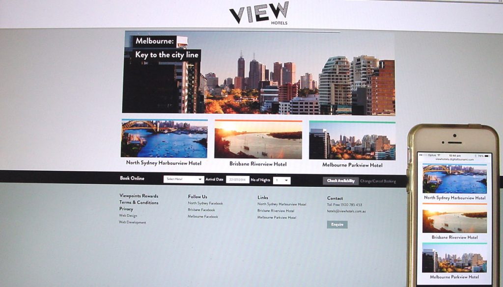
Responsive design ‘de rigeur’ for new sites
July 28, 2014Since late 2012, all new Digital Tsunami online sites have been developed with responsive design. The latest responsive sites, launched on July 25, are for View Hotels and Compass Capital. These responsive sites are accessible to all, irrespective of the platform on which they are viewed. Content presents appropriately on all devices (desktops, laptops, tablets, phablets and smartphones) by adapting to the width of the browser. The relentless growth of mobile device usage, indicates that a responsive site is a necessity for all corporations and organisations. Whereas 'mobile' sites (using a separate database from the same company's website) can detect the device and present a single mobile version, and an 'app' may be restricted to devices and even operating systems, a responsive site utilises the latest technology to sense the width of the browser and can present a customised solution according to the client's preferences. The fact that the responsive site delivers desktop and handheld sites generated by a single database on a single CMS, ensures the greatest efficiency in content management. On a handheld device, the traditional horizontal menu is replaced by a 'hamburger' menu icon (three horizontal parallel lines), which opens a vertical tiered menu. Columns of content in the header, main panel and footer are reorganised 'on the fly' subject to browser width. This can be easily demonstrated on a desktop computer, by dragging the right side of the browser window slowly to the left. As width reduces, the number of columns displayed on a responsive site will reduce. Digital Tsunami has a philosophy of agile development and promotion of innovative, proven solutions. Contact Digital Tsunami today to discuss the 'Communications Evolution' of your brand. -
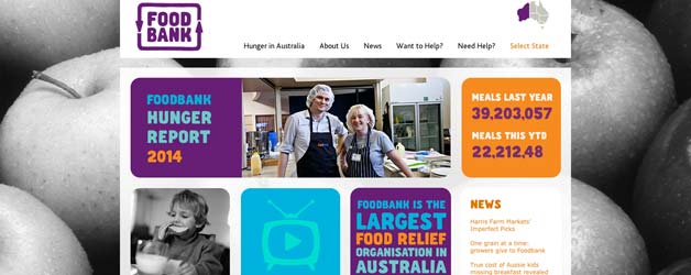
Responsive site launched for Foodbank in Australia
May 23, 2014A new responsive presence has just launched for Foodbank in Australia, a national network of non-denominational, non-profit, state and territory logistics suppliers, providing a warehousing and distribution conduit between food producers, manufacturers and retailers with surplus food and grocery items and the thousands of charities and community groups which feed hungry families and individuals across the country. Foodbank is the largest hunger relief organisation in Australia, with distribution centres in all state capitals and a number of regional centres, delivering the equivalent of almost 40 million meals in 2013, and 200 million meals since 1992. However, even this is not enough to meet the increasing demand of ordinary Australians in crisis. According to the 'End Hunger in Australia Report' commissioned by Foodbank, and compiled with data from over 200 charitable organisations nationwide, the demand for food relief continues to outpace supply around Australia, with more than 65,000 people turned away each month, from charities with insufficient food to provide them. The launch of the responsive site is the latest collaboration in a long relationship between Digital Tsunami and Foodbank in Australia. Initially assisting Foodbank NSW to upgrade a dated website in 2000, Digital Tsunami went on to provide pro-bono support to the federated organisation for over a decade, contributing to its evolution from disparate state operations into a coherent and powerful entity with consistent branding and online presence. Past CEOs have commented: “the new Foodbank website, designed, built and maintained pro bono by Digital Tsunami, has been the principal tool in lifting Foodbank's profile. Foodbank just wouldn't be where we are today without Digital Tsunami.” Bronwyn Boekenstein “Digital Tsunami has supported Foodbank for over a decade .. constantly looking for new ways to add value and improve our online communications channels.” John Webster Business and Communications Manager, Sarah Pennell stated: “Digital Tsunami helped us to see the potential of video in bringing our new website to life .. delivered a great selection of videos, that really tell the Foodbank story and will be a great addition to our communications.” After developing a sophisticated national web presence, which was progressively deployed for each of the state and territory organisations, Digital Tsunami has taken the 'Communications Evolution' of the brand into a cutting edge, responsive platform which rolled out overnight. This ensures that each site (of a multi-site solution) presents appropriately on all devices (desktops, laptops, tablets, phablets and smartphones) by adapting to the width of the browser. Whereas mobile sites (separate from a website) can detect the device and present a single mobile version, the Foodbank site utilises the latest technology to sense the width of the browser and present a customised solution according to the individual state or territory preferences. This can be easily demonstrated on a desktop computer, by dragging the right side of the browser window slowly to the left. As width reduces, the homepage grid of 4 columns reduces to 3, 2 and one, but also the items are repositioned or suppressed as desired. The responsive Foodbank site also features full-screen vectored background images, dynamic statistics, integrated videos, archived publications, donation forms with secure e.commerce, and hierarchical access to a sophisticated and easy-to-use WordPress content management system (CMS). For the last two years, Digital Tsunami has exclusively developed responsive sites. The relentless growth of all statistics related to mobile device usage, indicates that a responsive site is a necessity for all corporations and organisations. Contact Digital Tsunami today to discuss the 'Communications Evolution' of your brand.