Ensō Screen identity
Close


Overview
Ensō Screen is an Australian production company, developing limited series and feature film projects.
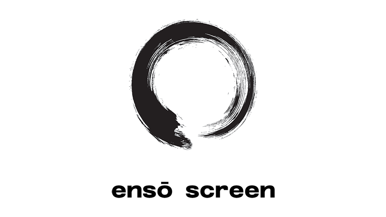
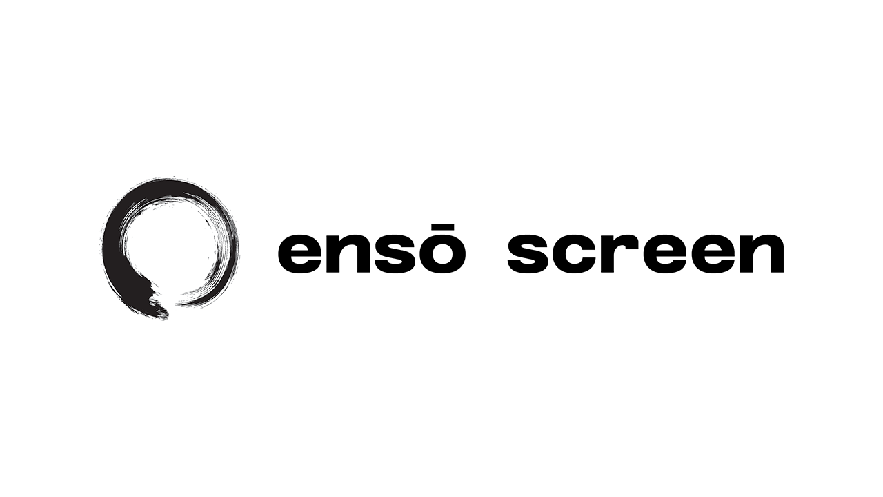
The first step was conceiving and creating new identity, based on the Japanese Zen Buddhist ensō symbol, which represents a pursuit for perfection and an appreciation of the imperfection of nature.
Creating a new identity for a startup (or reinventing or refining the identity of an established enterprise), is a process we call ‘The birth of a brand’. Any brand identity is comprised of: a brand name (and domain name), logo, font, colour palette, ‘tone of voice’ and visual assets.
Simplicity in design is the goal. Good design is not about elaboration, but simplification .. until only the purest essence remains .. to convey the message most potently. However, achieving simplicity sometimes requires considerable thought and time.
A font was selected for its legibility and character.
Details
| Client: | Ensō Screen |
| Solution/s: | branding |
| Sector/s: | screen production |
| Region/s: | Asia / Pacific, Australia, Americas, EMEA |
| Language/s: | English |
| Scope: | identity development |
| Features | brand development, logo development |
From Our Clients

Central to the development process is Digital Tsunami’s thorough understanding of the project needs, clear and constant communication, and creative, innovative and meticulous approach to delivering solutions.
.. accurately interpreted the project brief and the outcome was a piece of cost effective quality work.
Digital Tsunami is awesome.
Knowledge far beyond my expectations, led to the site being beautifully creative with simplicity, which is just perfect for a young female artist.
Andrew's patience and respect was impeccable, but what I loved most, was that he just knew what to do EVERY single time ... just the perfect web creator.
Thank you Digital Tsunami. Thank you Andrew
The MULS Executive is delighted with this aesthetically pleasing, user friendly site.
We found Digital Tsunami to be a full-service operation and we are satisfied with the products delivered: from the (identity), banners, business cards, letterheads, to the student magazine.
We have been fortunate to work with Andrew and his creative team from the inception of our business. The design and execution of our site has been fundamental in winning over clients and establishing our footprint in a very crowded space. We also place great value on their input into our business process.