RESPECT for your brand
July 9, 2012Spam makes me think.
Mostly, it makes me think of betrayal of trust, and branding.
OK. Just about everything makes me think of branding. The result of 30 years of film and digital marketing!
Of course, spam also makes me think, “I’d like to get less of it”! However, due to multiple email addresses, human ingenuity, the extent and duration of my online exposure, and despite cautious online behaviour and the robust redundancy of multiple anti-spam measures, I consider it a functional inevitability. I rapidly scan it to recover the rare legitimate mail.
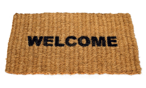
Today, I noticed an email for branded welcome mats.
Its’ sender does not consider this offer to be spam, but I do.
Think about it. Wow! A traditional mat at the entrance. Another opportunity to place my logo in public view, a greeting to visitors, cleverly hijacking the eyeline of everyone who enters the office?
Yes. All valid strategies.
Except for one thing.
Why would you intentionally invite visitors to wipe their feet all over your logo?
You brand deserves more.
Promoting your brand is more than simply plastering it on every available surface and in every possible material. Doing that is no different from plastering your message in unwanted messages. Spam.
(Musical interlude). Let’s listen to Mavis of The Staple Singers:
“If you don’t respect yourself,
Ain’t nobody gonna give a good cahoot”
This lyric reflects the core of branding, advertising and marketing.
Your brand is the representation of your company, product or service.
On launch (and even at the demise) of an enterprise, the name or logo encapsulates the concept which people will recall. (Think Apple. Then think ENRON).
Your company, product or service builds an identity for your brand. In turn, your brand grows to represent your company, products or service offerings.
It should always be treated respectfully to enhance your brand reputation, not denigrate it.
I never cease to be amazed at the destructive treatments which some marketers are prepared to subject their brand identity.
Apart from the branded mat!
Is it just laziness or lack of thought which permits some animators to spin a logo backwards or upside down (as the logo spins on its’ own vertical or horizontal axis)?
Surely, it is preferable to present it as a double sided solid, so that it is always legible and positive. Done correctly, this may even require a lower investment.
Why do clients in English speaking countries allow their brand to slide or the constituent letters to appear right to left, or drift down from the upper right to lower left side of screen. For people who read from left to right, that is the positive direction and the reverse is implicitly negative!
Let’s not even talk about clip art, overexposed stock library images, or the misuse of the colour palette!
Are all these failures just ignorance displayed by companies without the resource of a brand style guide or Marketing Director (for which they are anathema)?
One fundamental reason why some brands are globally recognised, is the rigorous protection of consistency in all brand applications. Fonts, colour schemes, icons, colour palettes, brandlines, all applied consistently, without exception.
In 2000, we developed a non-English language website for Heineken, with the benefit of an online style guide, proscribing and providing the graphical elements, formats and allowable variations across all media. All large multinationals should have this type of online resource.
Increasingly, startups are innately aware of the need for clear and unique branding. Young entrepreneurs and new enterprises are necessarily focused on the name and identity of their brand, and the need for a strong identity to cut-through the crowded marketplaces of VC, business and consumers.
More established companies can gradually neglect their brand and allow it to lose its’ impact.
Any company which respects their own brand, needs to develop it, nurture it, review it and if necessary, refine it, (both the logo and brandline), every five years or so, and impose strict guidelines for use to all internal and external stakeholders.
An if you need a mnemonic to remember this, here it is.
R.E.S.P.E.C.T.
Sing it, Aretha!
…
music:
The Staple Singers (live at Wattstax 1972)
Kane Gang (a vibrant and respectful re-interpretation from 1985)
From Our Clients

For providing a reliable, fast, and well maintained hosting service for business websites, I recommend Andrew and his company Digital Tsunami. The technical support given has been above and beyond, their hosting the fastest I have experienced, and is very well maintained with no issues.
Andrew certainly bends over backwards for his new and current clients, and I can tell he genuinely cares about providing nothing short of an outstanding service.
Digital Tsunami’s work for Leighton International has been of an extremely high quality, highly responsive and flexible in approach. Andrew and his team worked with us to understand our needs and find the most appropriate solutions.
Andrew helped us to see the potential of video in bringing our new website to life.
He held our hand through the process, making it as undaunting as possible.
He delivered a great selection of videos (from a one-day shoot), that really tell the Foodbank story and will be a great addition to our communications.
I worked with Andrew on a photography project that involved a high level of visual complexity for a multinational client. Andrew was clear and professional in his briefing, but at the same time, was open to other ideas and approaches.
We are delighted with our new website and early feedback from clients and associates is very positive.
The overall impression is that it is a very professional, informative website and conveys the feeling that Sefiani is a quality organisation with skilled, friendly staff.
Thank you for all your help and patience in working with us for this successful outcome.