Type and image considerations in responsive design
April 24, 2014Today, typefaces are no longer the sole province of print media, but are read on a plethora of screen-based platforms; desktop and laptop computers, phablets, tablets, smartphones; as well as a diversity of specific e-Readers (including Cybook, Icarus, PocketBook, Pyrus, Nook, Kindle and Kobo)*
People view Internet sites on handheld devices and read e-books on computers as well as mobiles. This variety of ‘delivery mechanisms’ adds a dimension of complexity to the job of the designer.
Ilene Strizver, typographic consultant, designer, writer and founder of The Type Studio, addresses this in the Fonts.com blog.
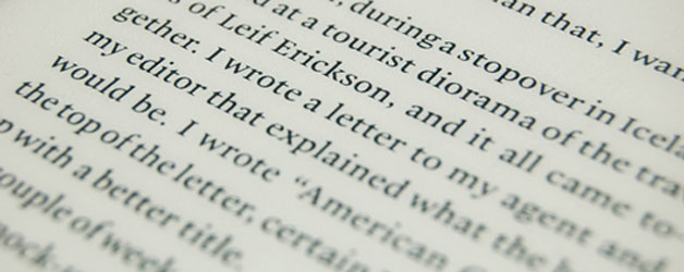
“Legibility and readability of the content are key to engaging and holding the reader’s attention.
So, which category of typeface is the better choice: serif or sans serif?
While sans serif designs have in the past been the “type style of choice” for live text on the Web .. the high resolution of much of today’s digital media, coupled with advanced font technology, has increased the clarity and legibility of fonts used for screen-based media.”
Read more articles on responsive design
The preparation of images too, requires consideration for sites built with responsive design.
Whereas a non-responsive site may have small static ‘thumbnail’ images which link to enlargements appearing in a shadowbox, thumbs on a responsive site may actually increase in size as the page format adjusts from multiple columns to a single column.
Many developers will use an ‘intelligent’ CMS (like WordPress) which automatically creates ALL web images from a single original uploaded image (which may be as much as 2000 pixels wide). This ensures that the image is at its highest resolution (and most modest file size), in appropriate dimensions for every appearance. This approach satisfies accessibility, usability, rapid page load times and visual quality and impact.
In recent months, Digital Tsunami has launched scores of responsive solutions and is constantly delivering sites built with responsive design for national and international clients.
If you want to capitalise on the massive growth in mobile Internet traffic for your brand, contact Digital Tsunami today to plan an upgrade to the latest technology.
Selected sites built with responsive design:
Building, Construction and Engineering
GroupOne.com.au
SydneyEnergy.com.au
Corporate Services
Comsec-Offshore.com
Education
Cameragal.nsw.edu.au
Entertainment
JennaDearnessDark.com
Government
LRWG.com.au
Health and Safety
NeckSafe.com
Hospitality
ViewHotels.com.au
Legal
NorthsideLaw.com.au
Manufacturing
OysterShellSystems.com
Resources
OwenHegarty.com
Security
Ballistics.com.au
Related articles
Mobile video consumption keeps growing
1,040% increase in Internet time spent on tablets
World going mobile, as smartphone sales to exceed PCs
Comsec trilingual responsive site launched
What does “responsive” really mean?
More articles on the mobile marketplace
*Reviews of e-readers in the Australian market on cNet
Comparison of e-book readers in Wikipedia
About Fonts.com
The Fonts.com™ store from Monotype offers more than 150,000 desktop and Web font products for you to preview, purchase and download.
The Fonts.com blog offers a daily dose of typography (for print, web, mobile and more). The blog often announces new fonts, such as the Slab Serif font Silica, which owes its heritage to the demands for attention-getting early print advertising of 1815.
From Our Clients

(We) took a fairly substantial audit of .. sophisticated sites both technically and creatively .. Out of six prominent designers, Digital Tsunami stood out.
The quality of the images, the sophisticated management of text .. together with smooth animations makes (our) website of very high calibre.
I would personally rate this site in the top 2 percent of world wide web sites today.
I could not be more delighted. Once again Thank You. You and your team at Digital Tsunami have been incredible.
With a brief timeline to ensure we had a web presence and launch coinciding with our 10 year anniversary, Digital Tsunami delivered. On time. On budget. Great Effort!
Andrew and his team have provided consistently good service and met both our needs and expectations. He certainly knows his stuff and delivers workable web solutions in a highly professional manner.
Digital Tsunami’s work for Leighton International has been of an extremely high quality, highly responsive and flexible in approach. Andrew and his team worked with us to understand our needs and find the most appropriate solutions.