What does “responsive” really mean?
March 22, 2013In speaking with numerous people recently, it is clear than many do not understand the meaning of the term “responsive design” as applied to a web presence. Resizing and responsive are two entirely different animals. Let me explain.
A responsive site is one which responds to the width of the browser.
That does not mean that the site simply shrinks to a miniaturised version, but that it dynamically reformats to present the most appropriate (and readable) content.
The growth of Mobile
When you last used public transport, went to a concert or were in a public place, what did most people hold in their hands?
No one will deny that handheld devices, including tablets and smartphones, have transformed the marketplace. Five times more smartphones were sold globally in 2012 than desktop computers1. The time spent connected to the Internet via handhelds is increasing as time via desktops decreases2, and increasing numbers are “second screening”3 on a handheld while watching television.
Yet, because 99% of desktop and laptop users are viewing a screen of 1024 x 768 pixels and above4, most web developers continue to design for that size, or in a fluid design which scales up (and only up) from that width, entirely disregarding mobile.
Mobile sites
Enterprises which recognise the need to serve different format (and sometimes tailor content and functionality) to their customers, are developing ‘mobile’ sites, custom-designed for smartphones and handheld devices, and utilising a separate content management system (CMS)5. This is necessary if the functionality of your stakeholder interaction demands it.
However, for the vast majority of brands, there is a far more efficient approach than either of these two extremes.
Responsive design
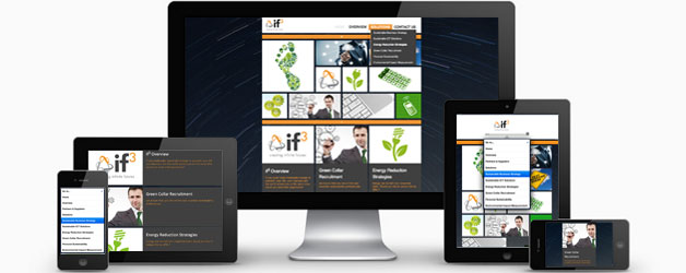
Developing a web presence in a responsive design, ensures that the site will resize (up or down) to the width of the browser and present the navigation in a highly legible, pull-down-menu format.
The best responsive sites will respond to the changing width of the screen whether caused by device orientation (on a handheld) or browser resizing (on a desktop or laptop).
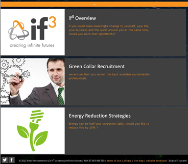
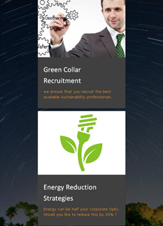
Panels containing images and text will reformat to horizontal or vertical, as appropriate, and the number of panels will vary according to width (e.g. Pinterest)6. Sometimes the images themselves will resize (e.g. YouTube)7.
That all of this can be achieved within a single CMS is a huge commercial benefit, generating high ROI both from the lower initial investment and the reduced resources required for ongoing managment. There is no need for dual input when one CMS can manage sites for all desktop and mobile platforms.
If the platform used is as well-tested and ubiquitous as WordPress, even the SEO will be exceptionally efficient!
Navigation
The horizontal main nav and pulldown menus on the desktop, transform into a bold, highly legible single pulldown menu on handheld devices.
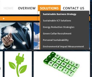
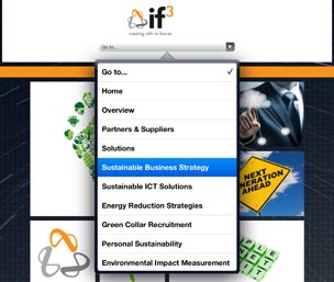
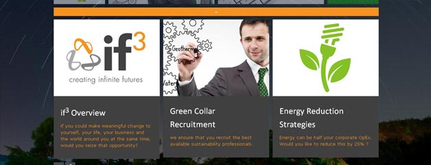
Image panels
Large images and text are progressively scaled ..

to conform with available screen width on handheld devices


Image and text panels
Where text and images are connected, multiple vertical columns will convert ..
to horizontal columns on a tablet and vertically stacked panels on a mobile phone.
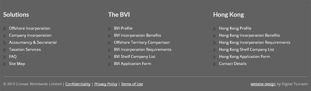
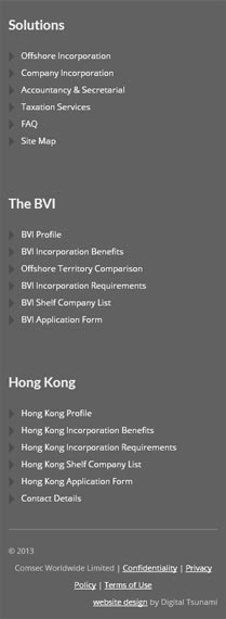
Footer nav
On a desktop, laptop or landscape tablet, footer nav appears as multiple columns, but
.. transforms into a single vertical column on a portrait tablet or smartphone.
Digital Tsunami can help you to prepare a strategy and present your brand effectively across all online and offline media. Contact Digital Tsunami today.
Sources:
1.i Australian Financial Review (AFR) report on International Data Corporation (IDC) data of 2012 hardware shipments: 722 million smartphones, 148.4 million desktop PCs, 128 million tablets.
1.ii Google MobileThinking
2.i Nielsen’s “Australian Multi-screen Report Quarter 4 2012”
“Demographic variation is evident. The largest segment of each age group has a distinct preference for the medium on which they watch video. 50-64 yo watch television (24%), 35-49 yo watch the Internet (28%) and 25-34 yo watch on a mobile phone (37%)
2.ii BusinessWire ‘time spent connected by device’
2.iii Connected Intelligence ‘in-home Internet connected devices’
3.i Deloitte ‘second screening’
3.ii GigaOm “How new devices, networks, and consumer habits will change the web experience”
“Mobilizing web design is a catch-22; adjusting to design challenges is costly, but not adjusting is equally costly, because a poor mobile web experience results in a loss of revenue.”
3.iii GigaOm Up to the end of November 2011, camera-equipped smartphones took 27% of photos, a significant increase from 17% in 2010. For many people, smartphones have replaced Point-and-shoot cameras.
4 w3schools ‘browser screen size’
5 ThinkWithGoogle ‘Mobile Planet interactive statistics’
6 Pinterest
7 YouTube
8 comsec-offshore.com
9 if-3
10 jennadearnessdark.com
From Our Clients

It is clear from the enthusiasm and professionalism shown, that Digital Tsunami views each client as a long term partner contributing ideas above and beyond the development of the site and we look forward to involving them in future marketing initiatives.
I recently engaged Digital Tsunami to design and build my 60-page website. I'm a website copywriter who relies heavily on web-generated business, so my own online presence needs to be impeccable.
The solution that Digital Tsunami supplied is brilliant. It meets my needs perfectly; it's clean, bold, elegant, fast, and easy to edit. I've had lots of very positive feedback about it, and since launch, my request for quote rate and conversion rate have increased markedly.
The team at Digital Tsunami was incredibly responsive, delivering a solution well ahead of deadline. Their technical knowledge was exceptional, they were innovative, and they were very meticulous. What's more, they understood my business and technical requirements and translated them into a user-friendly, refined, professional site which is conceptually simple and cohesive.
I have no hesitation in recommending the website design services of Digital Tsunami to any business .. that needs a stand-out online presence.
For providing a reliable, fast, and well maintained hosting service for business websites, I recommend Andrew and his company Digital Tsunami. The technical support given has been above and beyond, their hosting the fastest I have experienced, and is very well maintained with no issues.
Andrew certainly bends over backwards for his new and current clients, and I can tell he genuinely cares about providing nothing short of an outstanding service.
Our take-away menu advertised TamarindThai.com.au, even though the site didn’t exist.
Digital Tsunami offered great ideas and design to set up a professional website that matches our name, ideas and style of the restaurant.
Andrew is very knowledgeable IT professional and he never hesitated to see and consult us in the restaurant.
You have demonstrated patience, perseverance, attention to detail and a rare ability to perceive what was needed even when we didn't. We are delighted with the site, it performs and looks great and our enquiry rate since it superseded our previous website has already increased by 20%.