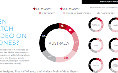
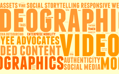
Last year, we predicted that the three most critical promotional tools for the year were mobile social media video This proved true, and these three will remain essential in 2014. However, the success of each has necessitated even greater effectiveness to attain cut-through in markets where there is massive competition for customer attention. Here are …Read More…
For over 3 decades, German industrial designer Dieter Rams was Braun’s Chief Design Officer, responsible for the style of a wide range of Braun products, from open reel tape decks to shavers. He even designed the Braun logo. He often stated “Less, but better”. As an advocate of the Functionalist School of industrial design, Rams …Read More…

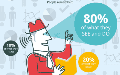
To explain the rationale behind the visual presentation of facts, and promote the benefits, Manchester infographic studio NeoMam has produced a dynamic parallax scrolling infographic. Built in HTML5 (the cross-platform compatible successor to Flash), the infographic clearly reinforces the power of visualising information. 13 Reasons Why Your Brain Craves Infographics [Infographic] by the team at …Read More…

For me, music has been a life-long love. Playing, purchasing, listening and producing it has been a constant in my personal (and often professional) life. An enduring curiosity has allowed me to explore and encounter wonderful new genres and artists. There are few limits to the types of music I appreciate, from baroque to deep …Read More…

All the image measurements for your brand’s social media presence, in one (extensive) infographic. For more graphical information, search our recent infographic blogs or visit our Pinterest board. Source: tentsocial.com

In speaking with numerous people recently, it is clear than many do not understand the meaning of the term “responsive design” as applied to a web presence. Resizing and responsive are two entirely different animals. Let me explain. A responsive site is one which responds to the width of the browser. That does not mean …Read More…

An infographic on the rapidly increasing use of a ‘second screen’ while watching television. For more graphical information, search our recent infographic blogs or visit our Pinterest board. Source: confused.com

Released on March 10, 2013, the Nielsen “Australian Connected Consumers Report 2013” provides insights into the evolving patterns of consumers’ media consumption. Data includes the aggregate time spent on the Internet per day, connectivity during the hours of the day, how age is reflected in device usage patterns, and the increase in ‘out of home’ Internet access. …Read More…

Musicians and performing artists are great users of social networks. The like / share / link functionality, the integraton of video, and the calls to action which link to websites and sales are ideal for promoting music. Digital Tsunami client Ru C.L (a.k.a King Ru) has just released video via his Facebook page. The video …Read More…

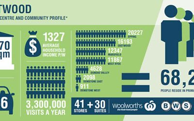
How do you present hard retail data in an interesting and visually arresting way? With infographics, of course! In recently developing a website for the owner and manager of multiple Sydney community shopping centres and retail strips, the amount of data rapidly approached overwhelming. To present this data entirely in figures would lack impact. The …Read More…