Master Residences Yinchuan branding
Close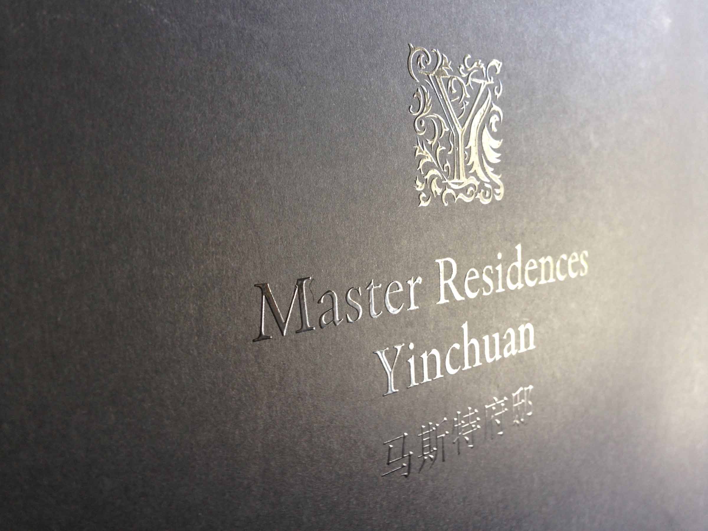


Overview
An exclusive, luxury residential precinct in Yinchuan, northern China needed a name. Andrew W Morse (founder of Digital Tsunami) was appointed Creative Director of the marketing for the property in July 2015. His responsibility was vision and strategy for the launch of this exceptional property.
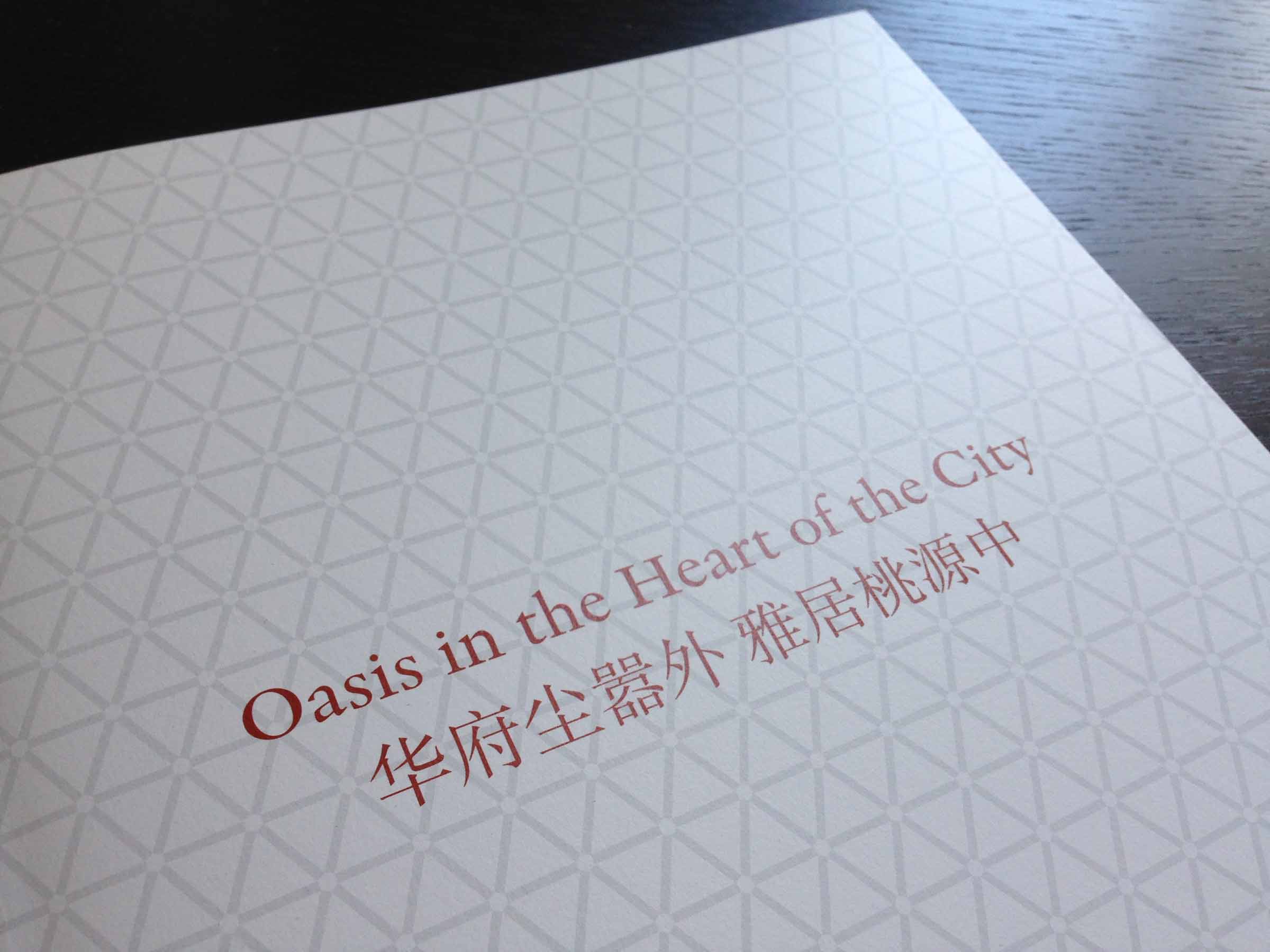
After multiple considerations, the name Master Residences Yinchuan was selected. To highlight the location of the precinct across from City Hall, the Exhibition Centre, new Opera House, Ningxia Museum and other important civic buildings, and inspired by Mr. Ma, corporation founder, Andrew created the brandline “Oasis in the Heart of the City”.
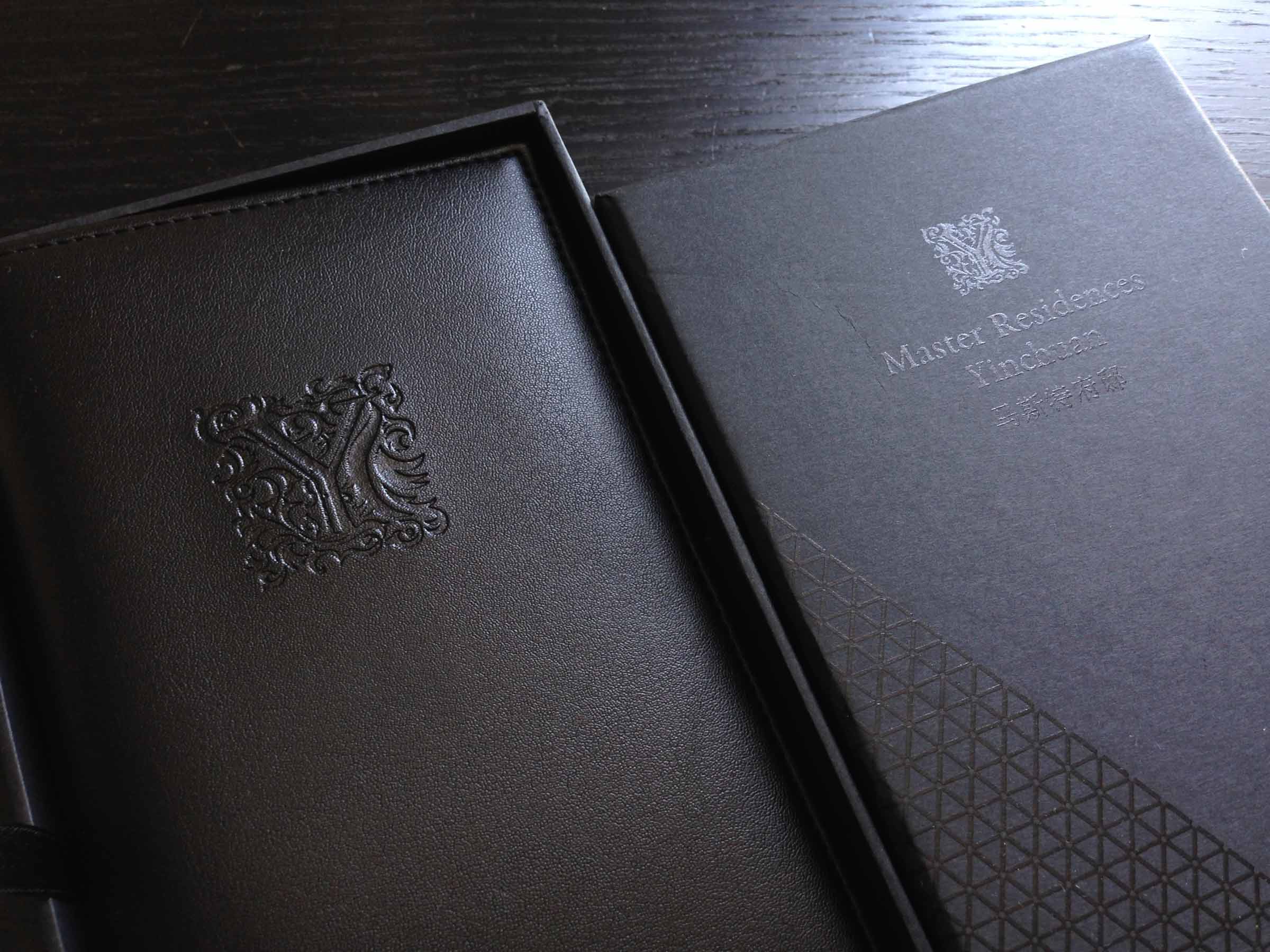
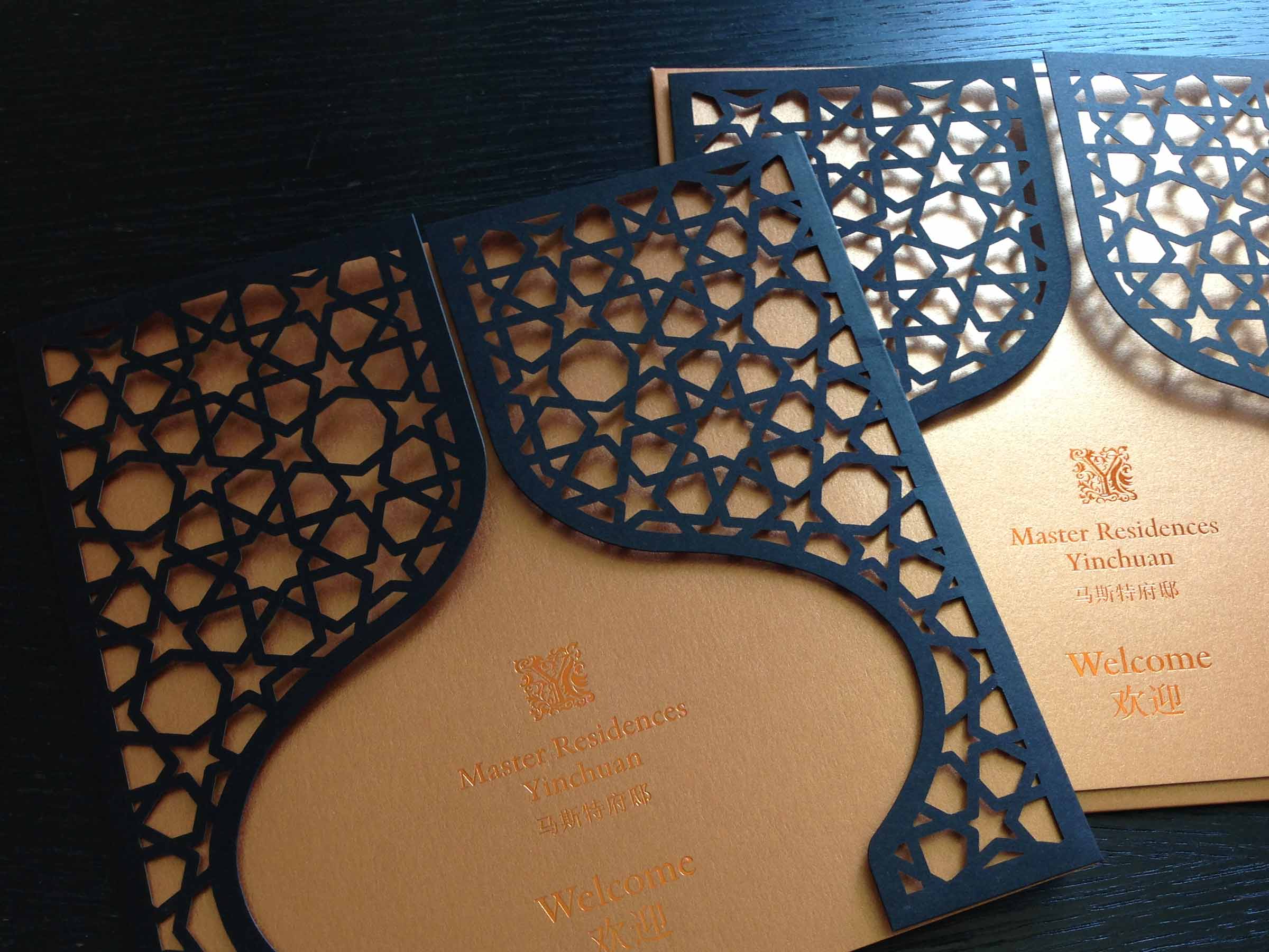
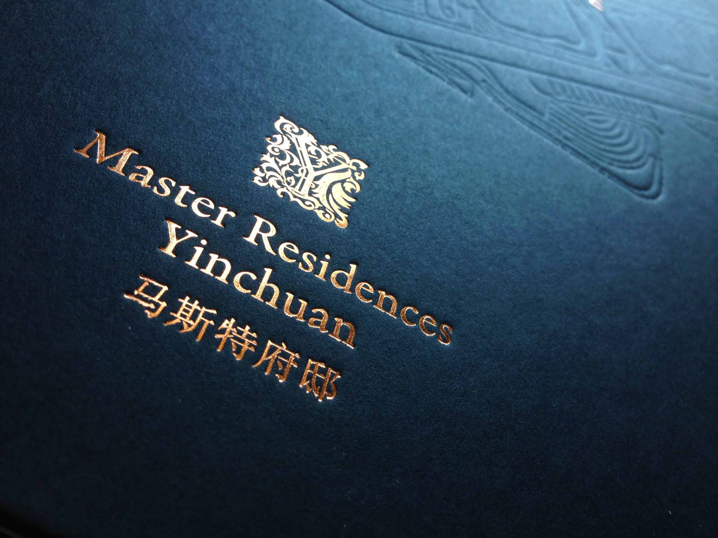
The identity (a letter ‘Y’ wreathed in the leaves of a native plant) was refined and applied to all collaterals. In print applications spot UV was used to subtly display a sheen on black surfaces. In invitations and hardbound books, a bronze metallic leaf was used, resembling the glow on sand dunes at sunset.
A triangular motif, (derived from the logo designed by Landor for the parent company Master), was applied extensively on endpapers and print collaterals.
For the 248 page hardbound book, revealing the exhaustive world-class technology of the properties, Andrew conceived the title “A Design Perspective” to encapsulate the focus on design excellence in concealed engineering fundamentals as well as the visible interior and exterior style.
The international design and content production team implemented the brand across an extensive range of bilingual advertising and marketing collaterals and premiums, including:
- a presentation folder
- 4K aerials
- computer graphic animation
- a double page press ad
- dual responsive online sites
- office and wayfinding signage
- a bilingual retractable banner
- dual language 4 page datasheets
- bilingual 48 page softbound booklet
- bilingual 106 page hardbound owner’s book
- bilingual 248 page hardbound technical book
- a printed video ‘book’ with auto-playing integrated video screen
- a debossed leather notepad and branded executive pen in a presentation case
- a diecut foiled invitation card, metallic paper envelope and hand stamped wax seal with silk tassel
- a luxury branded carry bag
The experience of Digital Tsunami was perfectly suited to ensuring a consistent implicit and explicit message throughout all online and offline touchpoints. This project is a perfect example of the production of a cohesive marketing campaign across all digital and tactile media.
Details
| Client: | Master Real Estate |
| Solution/s: | branding, identity |
| Sector/s: | real estate |
| Region/s: | Asia & Pacific |
| Language/s: | English, Mandarin |
| Scope: | branding, copywriting, online, photography, premiums, print, strategy, video |
| Features | liaison (Hong Kong, Shanghai, Yinchuan) |
From Our Clients

Andrew and his team have supported Foodbank by providing web services for more than a decade.
In fact, they have just undertaken the first complete redevelopment of the original Foodbank website they built for us, and have been maintaining so ably since.
Andrew is creative and passionate and helps us to keep up, constantly looking for new ways to add value and improve our online communications channels.
Andrew helped us to see the potential of video in bringing our new website to life.
He held our hand through the process, making it as undaunting as possible.
He delivered a great selection of videos (from a one-day shoot), that really tell the Foodbank story and will be a great addition to our communications.
Our take-away menu advertised TamarindThai.com.au, even though the site didn’t exist.
Digital Tsunami offered great ideas and design to set up a professional website that matches our name, ideas and style of the restaurant.
Andrew is very knowledgeable IT professional and he never hesitated to see and consult us in the restaurant.
By taking the time to understand our business, industry and vision, Digital Tsunami created a site that truly reflected our leadership position in the market and our strategic direction.
Digital Tsunami's expertise in visual design, photography, website navigation and business writing, resulted in an extremely effective website.
The project was expertly managed from end to end which resulted in a fast and efficient process.
Thank you for all your efforts in creating our new website which achieves our agreed objectives : elegantly smart, yet understated, professional and easy to use.