Optim identity
Close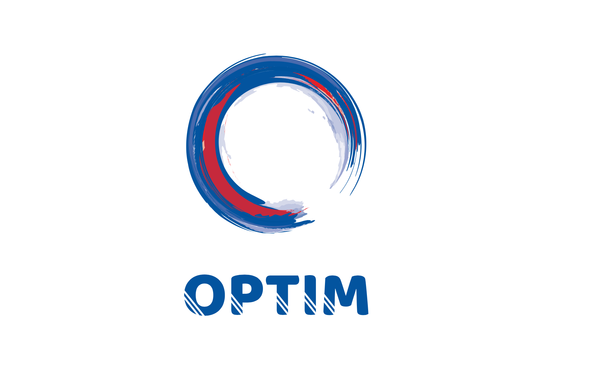


Overview
Optim is a dynamic Australian logistics solutions provider, with exceptionally personalised service, an agile approach and decades of expertise. Specialising in challenging and critically time-sensitive projects, Optim has built a reputation for delivering the seemingly impossible.
Founded in 1992, Optim was in need of an identity refresh, to reflect a 21st century brand.
Digital Tsunami was commissioned to manage the transition. Creative Director Andrew W Morse commenced the creative process with consideration of the components which contribute to the identity: the name, the nature of the business and the brand philosophy. The unique company name was to be retained.
An icon, logotype and brandline were presented.
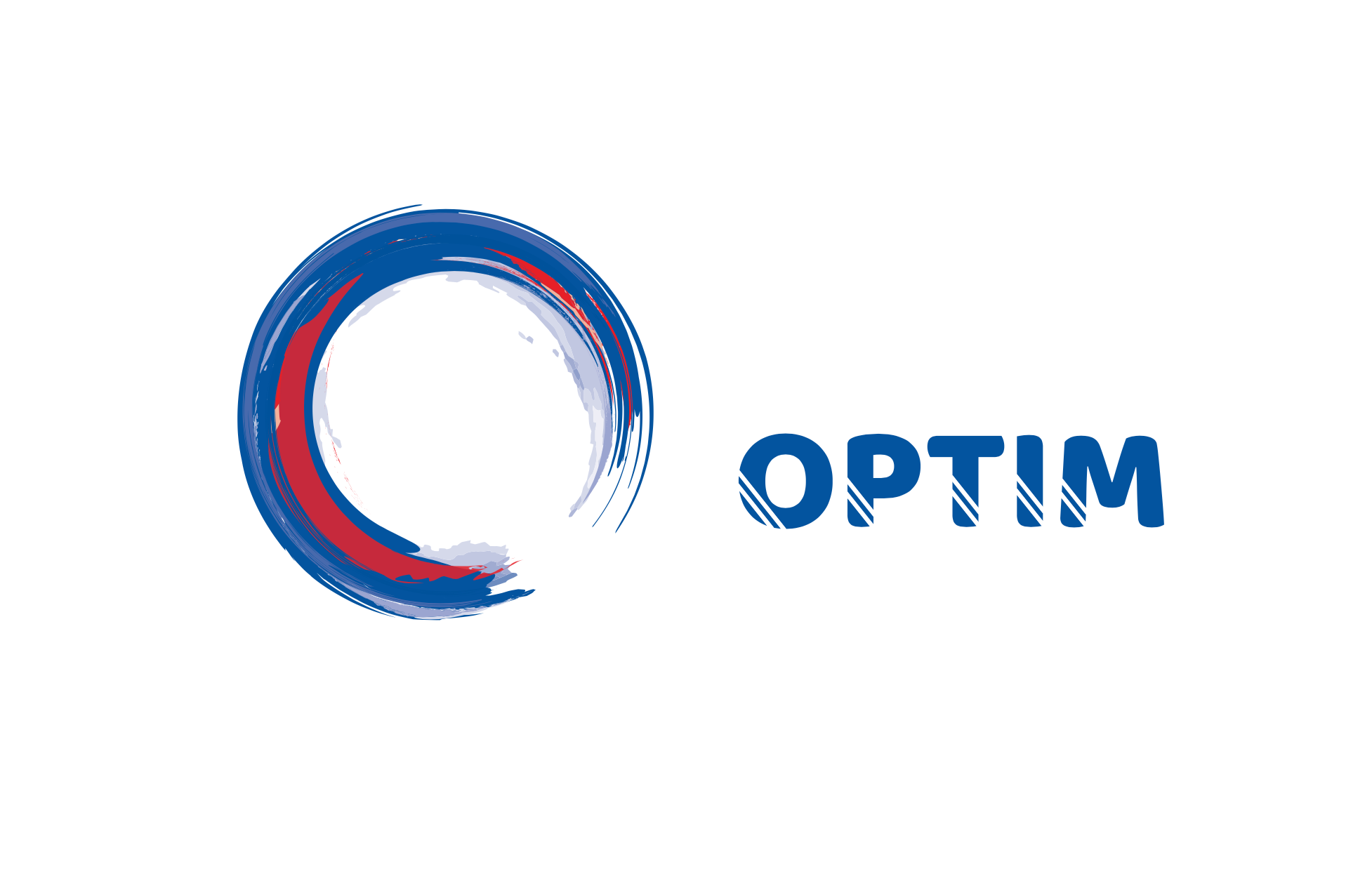
For the icon, the focal point was the capital ‘O’ of Optim. The impact, strength and completeness of a circle became the inspiration for a series of icon concepts and a nexus for both the global scope of the solutions delivered and the wholistic and agile approach to problem solving.
The circle reflects both the globe (around which Optim ships freight) and the shape of wheels on the many vehicles which are a part of any shipment’s journey.
Three visual concepts were developed in a series of iterations for the client’s consideration. Then, in close collaboration, an icon based on the Zen symbol Ensō was selected and refined. This freely drawn circular brushstroke represents a strength and a wholistic philosophy of life, yet it’s open shape reflects agility and the search for perfection.
For the brand name, a robust type face with character was found and then individualised by the addition of two straight lines, representing the wheel tracks of an aircraft, container Porttainer and Transtainer, truck or train.
The brandline, which encapsulates the scope of operations, the scale of oversize shipments and the effort which Optim devotes to delivering a superlative service, is: “Moving Heaven and Earth”.
As the range of top level domain names expands beyond dot com, the opportunity arose to select an appropriate domain name: Optim dot global!
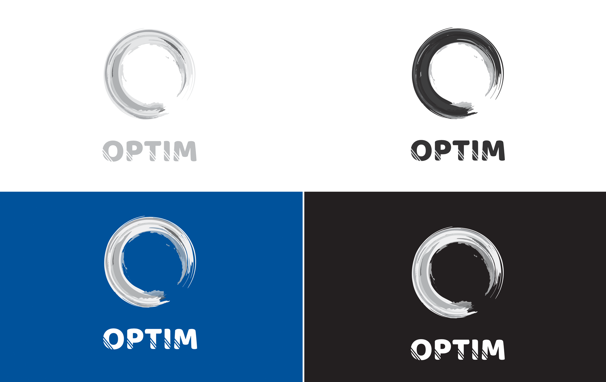
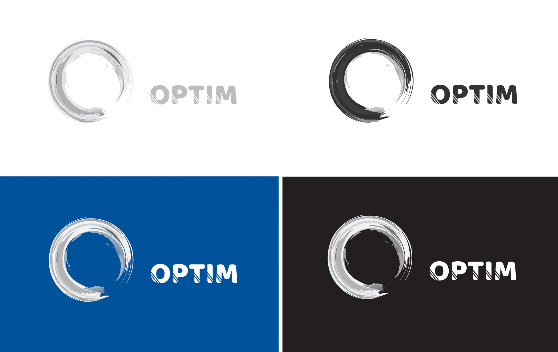
In collaboration with Sean and Dee at Design Davey, Digital Tsunami delivered: a contemporary brand identity; brandline; colour palette; fonts; new domain name; electronic document templates; business cards and a brand style guide.
This identity has now been implemented across multiple visual assets: business cards, office signage, branded notepads, and a web presence. Future applications extend to a fully ‘wrapped’ prime mover.
Details
| Client: | Optim Global Logistics |
| Solution/s: | branding |
| Sector/s: | logistics |
| Region/s: | Asia / Pacific, Australia, EMEA, Americas, Africa |
| Language/s: | English |
| Scope: | identity development |
| Features | brand development, logo development, print design, web development |
From Our Clients

.. accurately interpreted the project brief and the outcome was a piece of cost effective quality work.
I have enjoyed working with you on this important project and have been particularly impressed by your company's professionalism. The speed and accuracy of your work has been first rate and your creative input has been instrumental to the success of the project.
I happily recommend Andrew and the Digital Tsunami team.
I have dealt with many web marketing and support companies over the years, and have been very impressed with Digital Tsunami's response, advice and understanding of their field. I recommend talking to Andrew about your next web project.
I could not be more delighted. Once again Thank You. You and your team at Digital Tsunami have been incredible.
Andrew has a unique understanding of global business communication, combined with proven creativity in concept, design and production. He is extremely responsive to client’s requirements and has the ability to adapt and implement solutions extremely quickly in competitive markets.